


- adandypunk.com -quirky design, it really shows the personality of the designer and the fun of their work. I want to be able to highlight those aspects of myself in my site.
- pollenlondon.com -the design is sleek and modern, making it very easy to read- a reminder to not over clutter!
- imtawn.com -your attention is immediately grabbed by such a large image with very little text, again it looks very sleek and uncluttered
- strange.wales -the site is very light and monochromatic which lets the work steal the show because it is the only variety, also very simply organized
- jessewillmon.com -the design seems very personal with the appearance of hand drawn aspects highlighting the artist once again
- guillarmejuvenet.com -beyond my skill level but it is a good example of interactive and engaging design, maybe find a way to do that where I can bring an aspect of that in to my site
- vitosalvatore.com -his organization is a bit weird to me at first but it does appear to get better, the about page has a great concept for what an artist statement should include
- heckhouse.com -a large image is attention grabbing and the logo and site design are very personal to the artist which is something we need to have a strong grasp on
- seanjkassen.com -the first thing you see is actually a great indicator of his work
- vanderlanth.io -very sleek, an excellent use of repetition of the logo throughout to maintain cohesion and the identity of the artist
The biggest struggle for my concept is going to be figuring out how to represent my style. I tend to have a mix of organic illustrative pieces, and then very geometric sleek designs. This comes from my background in fine arts shining through in to my graphic design work. I have always wanted to achieve that balance, however, it seems a harder thing to conceptualize in to a cohesive site design and logo. A lot of these sites are super sleek. Do I want to conform to that? Will I risk looking too illustrative if I don’t? In search of a design that balances the aspects of my style, which part should be the focus?


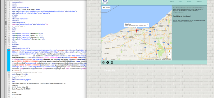 We just googled “embed google maps in html” and used
